How did the project come about? What was the brief?
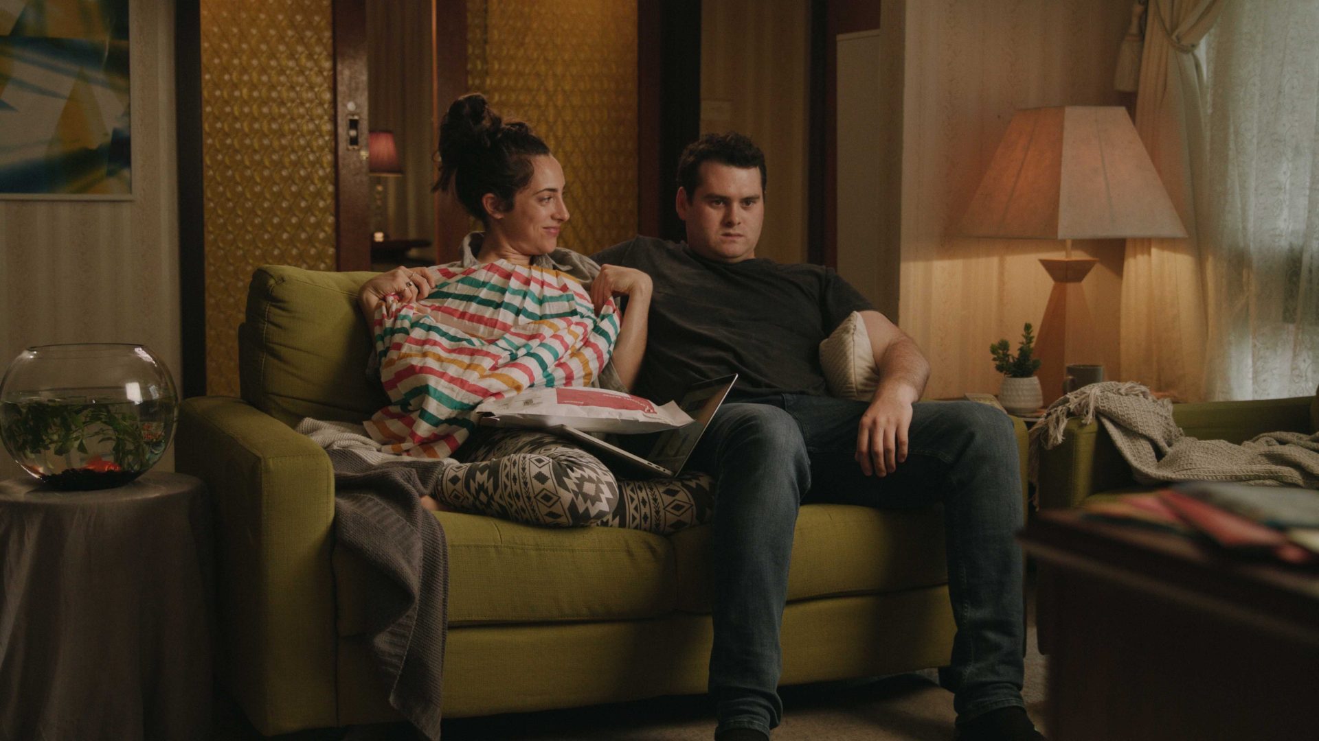
CSP needed to draw people off the couch and back onto the famous strip. I imagine business is slower than it once was and so they needed to get the attention of a younger audience who are choosing Uber Eats over a lovely night out. Make them feel like the couch is a far worse option than getting out and living life.
How was the idea conceived and developed? Describe the process behind developing the brief into a concept?
Crafting any idea is a balance with creating an interesting idea that responds to the brief while ensuring that it’s achievable within the budget. My main focus was to really drill down on what the worst things are about being on the couch. Those moments that really crystallise why getting involved in life is always the best option.
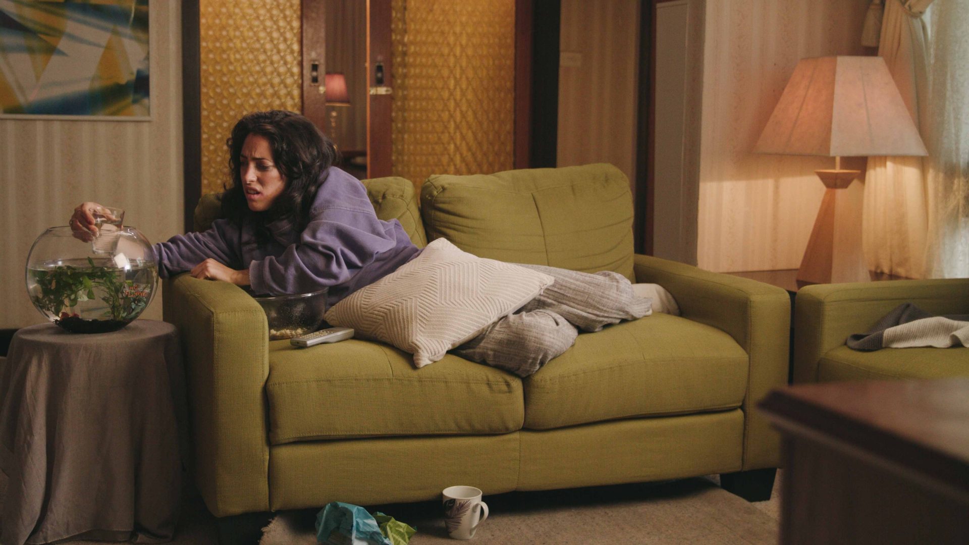
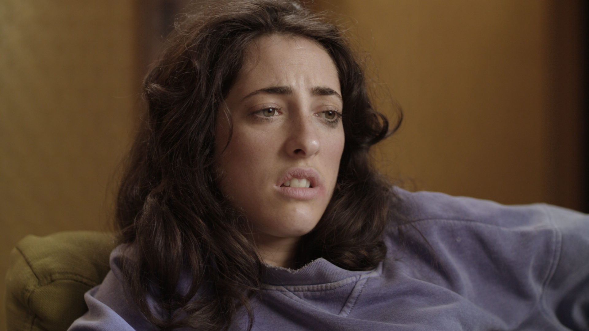
I drew from some of my own experiences, being hungover on the couch and feeling like making the trip to the kitchen for a glass of water feels like climbing Everest. You become a pathetic person, who through self-inflicted behaviour, can barely operate.
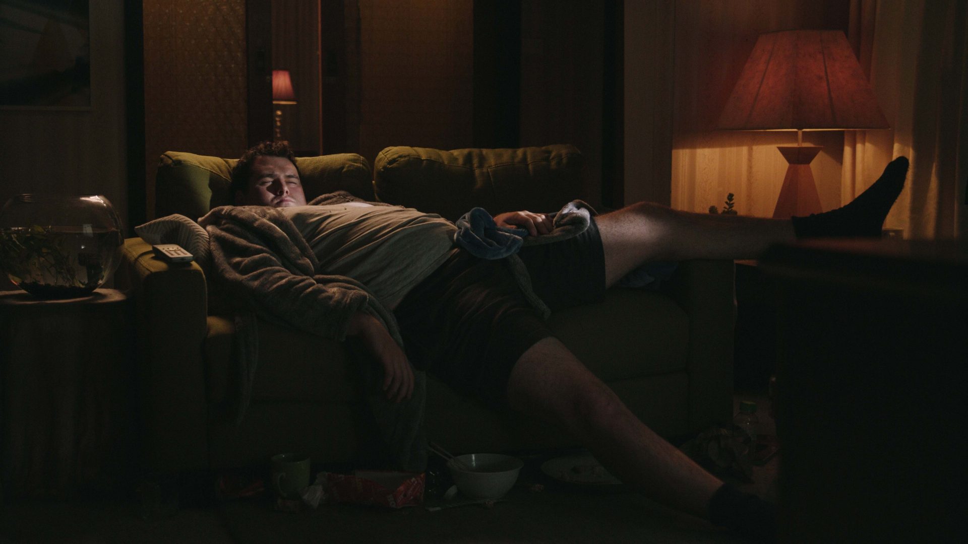
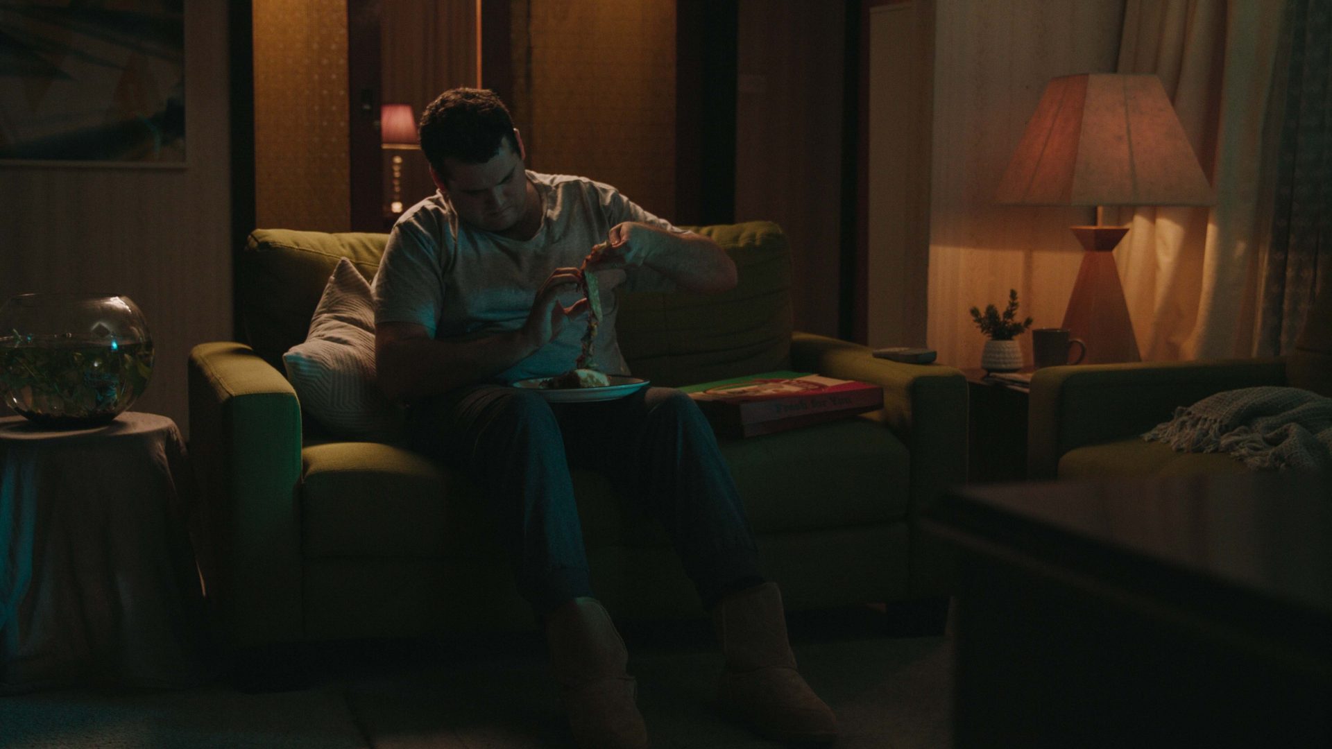
The laziness of ordering food online has plenty of pitfalls, so I aimed to target these all in one go. I figured if I can paint the people on the couch as people we don’t want to be, then the alternative of going to Chapel St Precinct seems like heaven.
